A histogram is a chart that displays the shape of a distribution. A histogram looks like a bar chart but groups values for a continuous measure into ranges, or bins.
The basic building blocks for a histogram are as follows:
Mark type:
Automatic
Rows shelf:
Continuous measure (aggregated by Count or Count Distinct)
In Tableau you can create a histogram using Show Me.
Connect to the Sample - Superstore data source.
Drag Quantity to Columns.
Click Show Me on the toolbar, then select the histogram chart type.
The histogram chart type is available in Show Me when the view contains a single measure and no dimensions.
Three things happen after you click the histogram icon in Show Me:
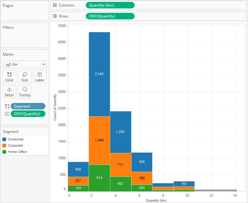
The view changes to show vertical bars, with a continuous x-axis (1 – 14) and a continuous y-axis (0 – 5,000).
The Quantity measure you placed on the Columns shelf, which had been aggregated as SUM, is replaced by a continuous Quantity (bin) dimension. (The green color of the field on the Columns shelf indicates that the field is continuous.)
To edit this bin: In the Data pane, right-click the bin and select Edit.
The Quantity measure moves to the Rows shelf and the aggregation changes from SUM to CNT (Count).
The Quantity measure captures the number of items in a particular order. The histogram shows that about 4,800 orders contained two items (the second bar), about 2,400 orders contained 4 items (the third bar), and so on.
Let's take this view one step further and add Segment to Color to see if we can detect a relationship between the customer segment (consumer, corporate, or home office) and the quantity of items per order.
Drag Segment to Color.
The colors don't show a clear trend. Let's show the percentage of each bar that belongs to each segment.
Hold down the Ctrl key and drag the CNT(Quantity) field from the Rows shelf to Label.
Holding down the Ctrl key copies the field to the new location without removing it from the original location.
Right-click (Control-click on a Mac) the CNT(Quantity) field on the Marks card and select Quick Table Calculation > Percent of Total.
Now each colored section of each bar shows its respective percentage of the total quantity:
But we want the percentages to be on a per-bar basis.
Right-click the CNT(Quantity) field on the Marks card again and select Edit Table Calculation.
In the Table Calculation dialog box, change the value of the Compute Using field to Cell.
Now we have the view that we want:
There is still no evidence that the percentages by customer segment show any trend as the number of items in an order increases.
Check your work! Watch steps 1-8 below:
Note: In Tableau 2020.2 and later, the Data pane no longer shows Dimensions and Measures as labels. Fields are listed by table or folder.
Line charts connect individual data points in a view. They provide a simple way to visualize a sequence of values and are useful when you want to see trends over time, or to forecast future values. For more information about the line mark type, see Line mark.
Note: In views that use the line mark type, you can use the Path property in the Marks card to change the type of line mark (linear, step, or jump), or to encode data by connecting marks using a particular drawing order. For details, see Path properties in the Control the Appearance of Marks in the View
To create a view that displays the sum of sales and the sum of profit for all years, and then uses forecasting to determine a trend, follow these steps:
Connect to the Sample - Superstore data source.
Drag the Order Date dimension to Columns.
Tableau aggregates the date by year, and creates column headers.
Drag the Sales measure to Rows.
Tableau aggregates Sales as SUM and displays a simple line chart.
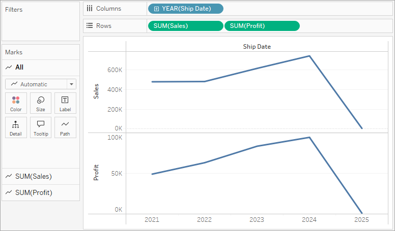
Drag the Profit measure to Rows and drop it to the right of the Sales measure.
Tableau creates separate axes along the left margin for Sales and Profit.
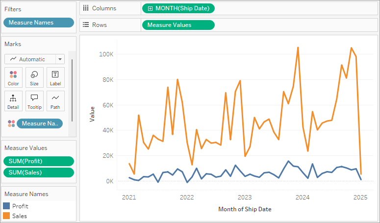
Notice that the scale of the two axes is different—the Sales axis scales from $0 to $700,000, whereas the Profit axis scales from $0 to $100,000. This can make it hard to see that sales values are much greater than profit values.
When you are displaying multiple measures in a line chart, you can align or merge axes to make it easier for users to compare values.
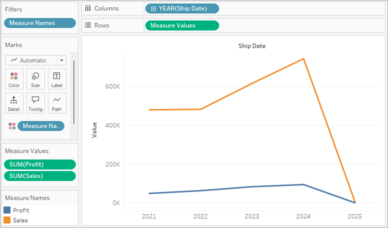
Drag the SUM(Profit) field from Rows to the Sales axis to create a blended axis. The two pale green parallel bars indicate that Profit and Sales will use a blended axis when you release the mouse button.
The view updates to look like this:
The view is rather sparse because we are looking at a summation of values on a per-year basis.
Click the drop-down arrow in the Year(Order Date) field on the Columns shelf and select Month in the lower part of the context menu to see a continuous range of values over the four-year period.
The resulting view is a lot more detailed than the original view:
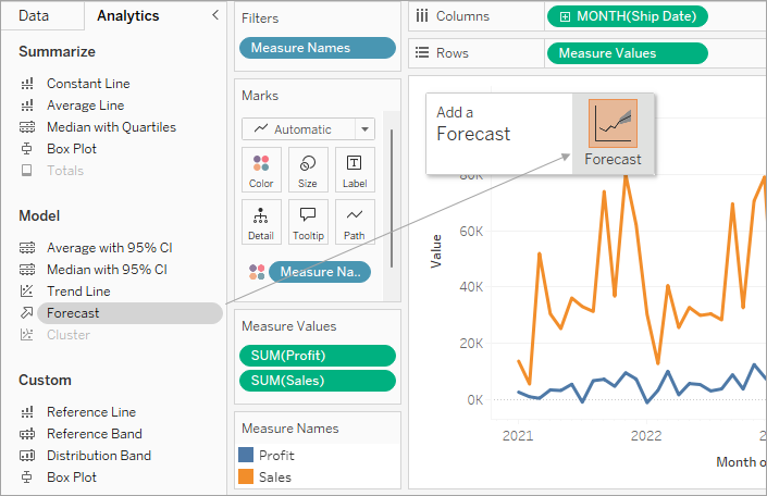
Notice that the values seem to go much higher just before the end of each year. A pattern like that is known as seasonality. If we turn on the forecasting feature in the view, we can see whether we should expect that the apparent seasonal trend will continue in the future.
To add a forecast, in the Analytics pane, drag the Forecast model to the view, and then drop it on Forecast.
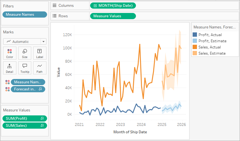
We then see that, according to Tableau forecasting, the seasonal trend does continue into the future:
Check your work! Watch steps 1-7 below:
Note: In Tableau 2020.2 and later, the Data pane no longer shows Dimensions and Measures as labels. Fields are listed by table or folder.
Use highlight tables to compare categorical data using color.
In Tableau, you create a highlight table by placing one or more dimensions on the Columns shelf and one or more dimensions on the Rows shelf. You then select Square as the mark type and place a measure of interest on the Color shelf.
You can enhance this basic highlight table by setting the size and shape of the table cells to create a heat map.
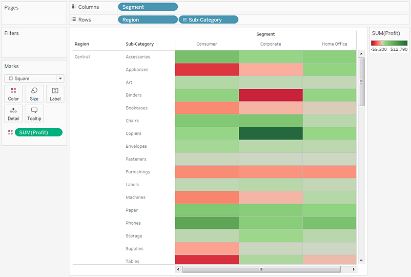
To create a highlight table to explore how profit varies across regions, product sub-categories, and customer segments, follow these steps:
Connect to the Sample - Superstore data source.
Drag the Segment dimension to Columns.
Tableau creates headers with labels derived from the dimension member names.
Drag the Region and Sub-Category dimensions to Rows, dropping Sub-Category to the right of Region.
Now you have a nested table of categorical data (that is, the Sub-Category dimension is nested within the Region dimension).
Drag the Profit measure to Color on the Marks card.
Tableau aggregates the measure as a sum. The color legend reflects the continuous data range.
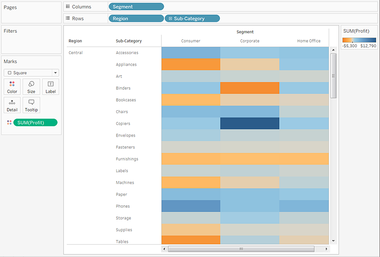
In this view, you can see data for only the Central region. Scroll down to see data for other regions.
In the Central region, copiers are shown to be the most profitable sub-category, and binders and appliances the least profitable.
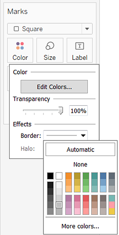
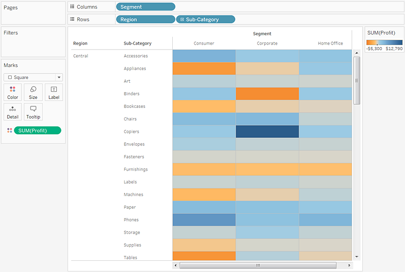
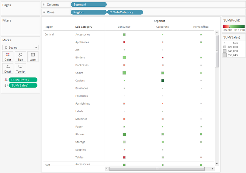
Click Color on the Marks card to display configuration options. In the Border drop-down list, select a medium gray color for cell borders, as in the following image:
Now it's easier to see the individual cells in the view:
The default color palette is Orange-Blue Diverging. A Red-Green Diverging palette might be more appropriate for profit. To change the color palette and to make the colors more distinct, do the following:
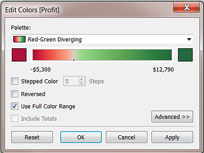
Hover over the SUM(Profit) color legend, then click the drop-down arrow that appears and select Edit Colors.
In the Edit Colors dialog box, in the Palette field, select Red-Green Diverging from the drop-down list.
Select the Use Full Color Range check box and click Apply and then click OK.
When you select this option, Tableau assigns the starting number a full intensity and the ending number a full intensity. If the range is from -10 to 100, the color representing negative numbers changes in shade much more quickly than the color representing positive numbers.
When you do not select Use Full Color Range, Tableau assigns the color intensity as if the range was from -100 to 100, so that the change in shade is the same on both sides of zero. The effect is to make the color contrasts in your view much more distinct.
Drag the Sales measure to Size on the Marks card to control the size of the boxes by the Sales measure. You can compare absolute sales numbers (by size of the boxes) and profit (by color).
Initially, the marks look like this:
To enlarge the marks, click Size on the Marks card to display a size slider:
Drag the slider to the right until the boxes in the view are the optimal size. Now your view is complete:
Check your work! Watch steps 1-9 below:
Note: In Tableau 2020.2 and later, the Data pane no longer shows Dimensions and Measures as labels. Fields are listed by table or folder.
Waterfall charts effectively display the cumulative effect of sequential positive and negative values. It shows where a value starts, ends and how it gets there incrementally. So, we are able to see both the size of changes and difference in values between consecutive data points.
Tableau needs one Dimension and one Measure to create a Waterfall chart.
Creating a Waterfall Chart
Using the Sample-superstore, plan to find the variation of Sales for each Sub-Category of Products. To achieve this objective, following are the steps.
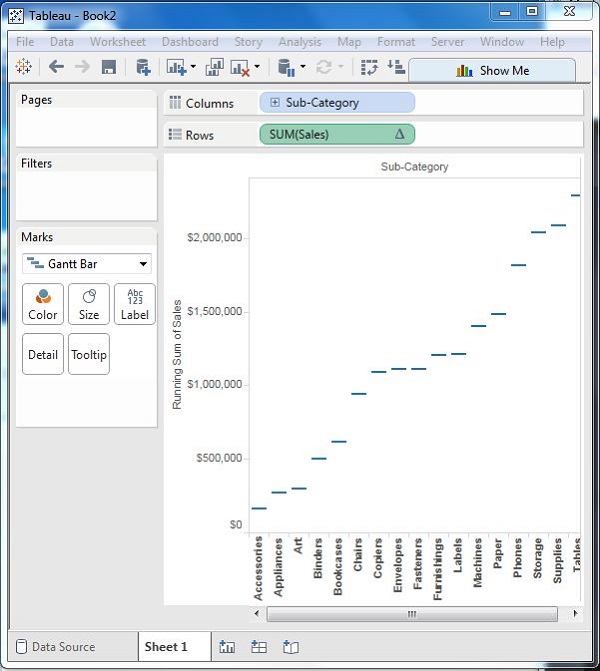
Step 1 − Drag the Dimension Sub-Category to the Columns shelf and the Measure Sales to the Rows shelf. Sort the data in an ascending order of sales value. For this, use the sort option appearing in the middle of the vertical axis when you hover the mouse over it. The following chart appears on completing this step.
Step 2 − Next, right-click on the SUM (Sales) value and select the running total from the table calculation option. Change the chart type to Gantt Bar. The following chart appears.
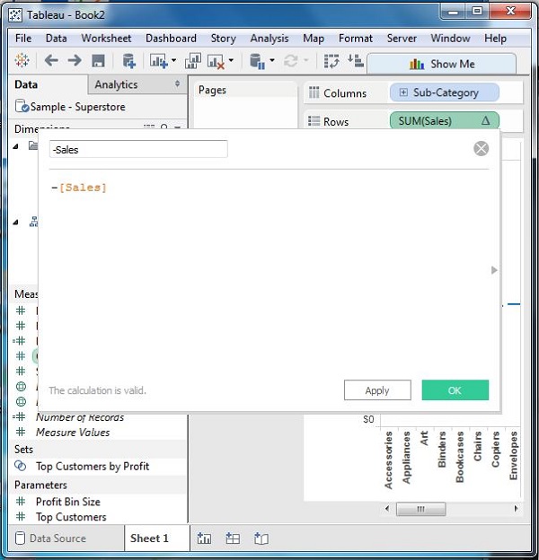
Step 3 − Create a calculated field named -sales and mention the following formula for its value.
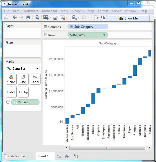
Step 4 − Drag the newly created calculated field (-sales) to the size shelf under Marks Card. The chart above now changes to produce the following chart which is a Waterfall chart.
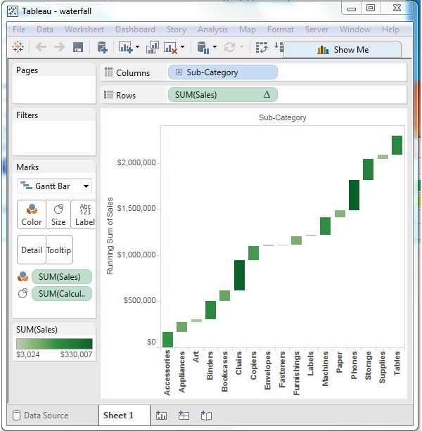
Waterfall Chart with Color
Next, give different color shades to the bars in the chart by dragging the Sales measure to the Color shelf under the Marks Card. You get the following waterfall chart with color.
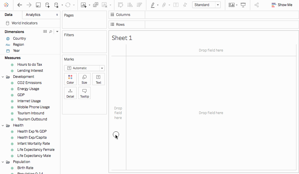
A bullet graph is a variation of a bar graph developed to replace dashboard gauges and meters. A bullet graph is useful for comparing the performance of a primary measure to one or more other measures. Below is a single bullet graph showing how actual sales compared to estimated sales.
Follow the steps below to learn how to create a bullet graph.
Open Tableau Desktop and connect to the World Indicators data source.
Navigate to a new worksheet.
Hold down Shift on your keyboard and then, on the Data pane, under Development select Tourism Inbound and Tourism Outbound.
In the upper-right corner of the application, click Show Me.
In Show Me, select the Bullet Graph image.
Click Show Me again to close it.
From the Data pane, drag Region to the Rows shelf.
The graph updates to look like the following:
Check your work! Watch steps 3 - 7 below:
Note: In Tableau 2020.2 and later, the Data pane no longer shows Dimensions and Measures as labels. Fields are listed by table or folder.
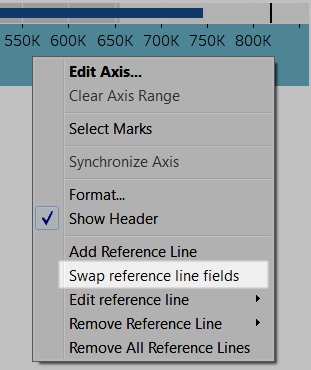
Swap reference line fields
Sometimes you might want to swap the reference lines fields. For example, the actual sales is shown as a reference distribution instead of a bar.
To swap the two measures, right-click (control-click on the Mac) the axis and select Swap Reference Line Fields.
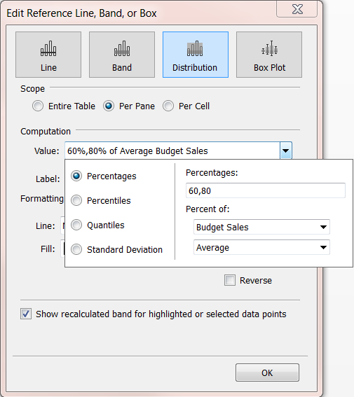
Edit the distribution
Right-click (control-click on the Mac) the axis in the view and select Edit Reference Line, and then select one of the reference lines to modify.
Stacked Bar Chart in Tableau is a tool that is used for visualization. It is used for visually analyzing the data. A person can create an interactive sharable dashboard using Stacked Bar Chart in Tableau, and that dashboard can be used to depict trends, variations in data using graphs and charts. It is not open source, but a student version is available. The interesting part about it is that it allows real-time data analysis. It can be used to connect to files, big data sources. Its demand for growth is being used in academics, business, and many government organizations.
Now let’s discuss what a stacked bar chart is? So, a Stacked Bar Chart is a bar chart that not only compares different categories of data in a graphical fashion but it also has the capability to break down the whole and compare parts of the whole. Thus, each segment in the bar represents different categories of the whole.
Now let’s begin the process of preparing a Stacked Bar Chart using Tableau. Before we begin let’s first know the difference between dimension and measures in a tableau dashboard as it is very important and will help us to understand easily.
So what is a measure and dimension in tableau?
The answer is Tableau divides the data into two parts. Dimensions are fields that cannot be aggregated or contain qualitative values (name, geographical data, dates) while measures are fields that can be aggregated and can be used for mathematical operations.
Stacked Bar Chart in Tableau
Below are the different approach to create a stacked bar chart in tableau:
Approach 1
Open Tableau and you will find the below screen.
Connect to a file using the connect option present in the Tableau landing page. In my case, I have an excel file to connect. Select the excel option and browse your file to connect.
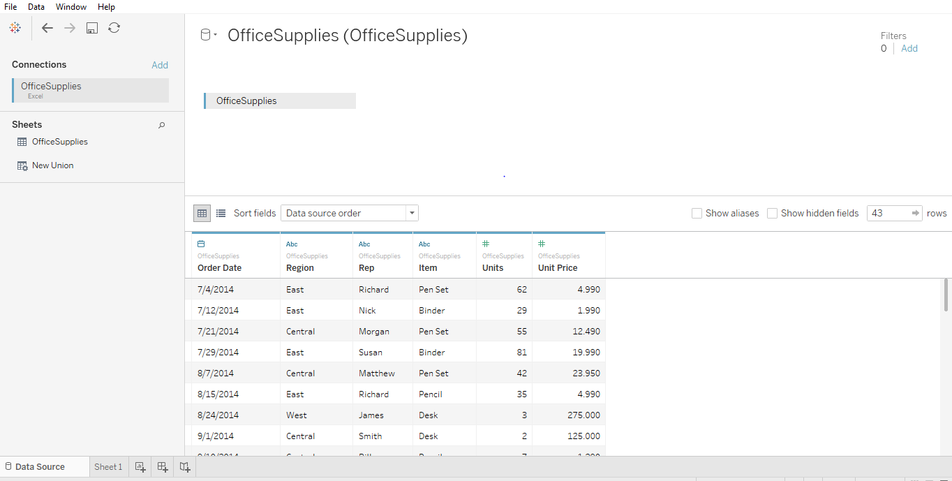
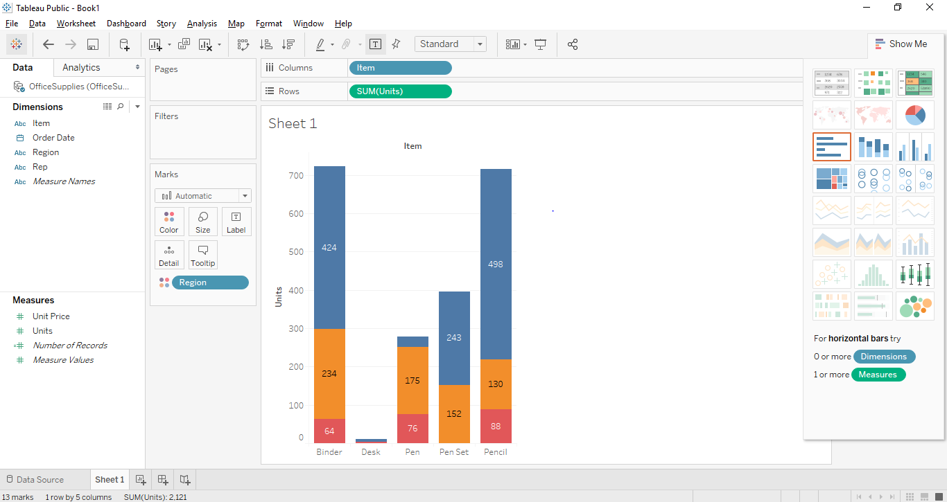
I am using office supplies dataset which has six attributes and includes both numeric and categorical values. The below screenshot shows how it looks in tableau once you connect to your sheet. If you look closely there are two attributes (Units and Unit Price) in the measurement region and four (Region, Rep, Item, Date) in the dimension region.
Click on sheet1 shown with the tooltip ”Go to Worksheet”. This is where you will prepare your visualizations. The below screenshot shows how it looks.
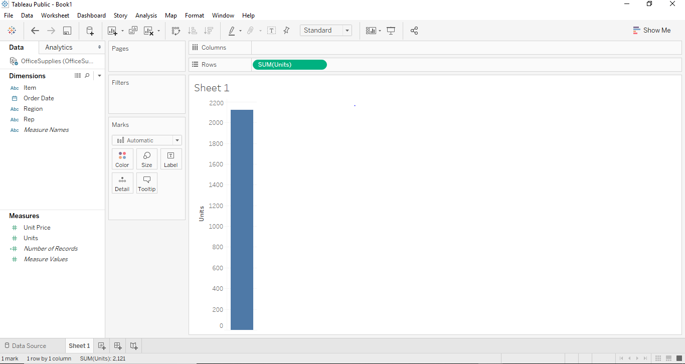
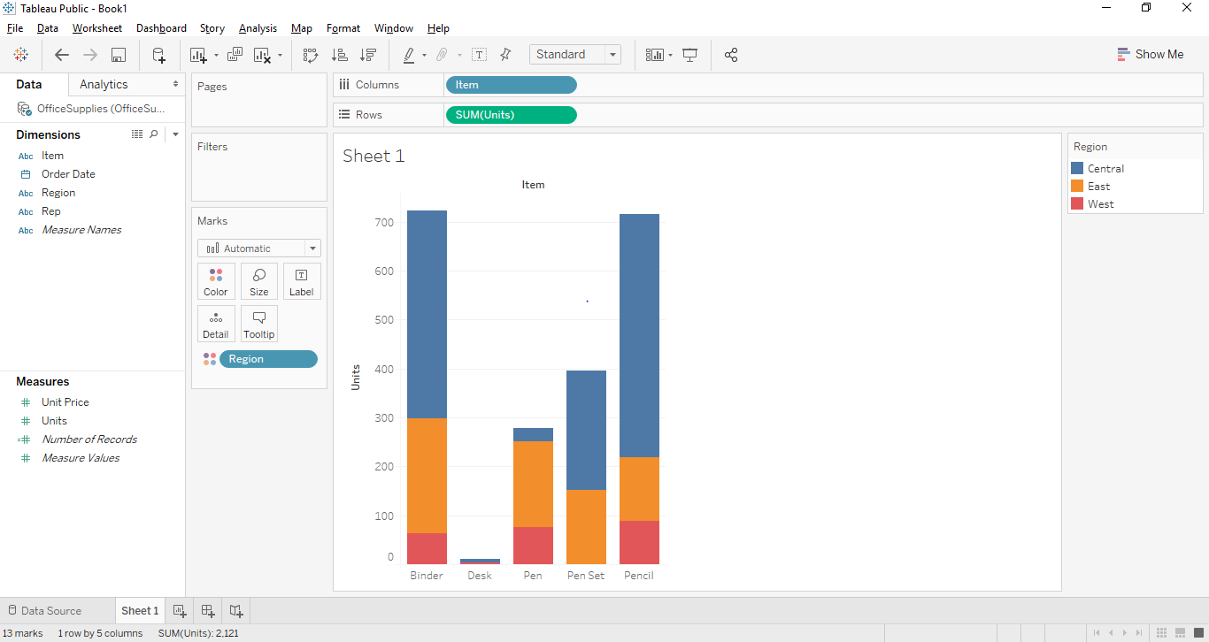
If we drag and drop one of the variables from measure region for example Units in our case. It will aggregate to the default sum and once you drag and drop them a bar chart will be created. The below screenshot illustrates this.
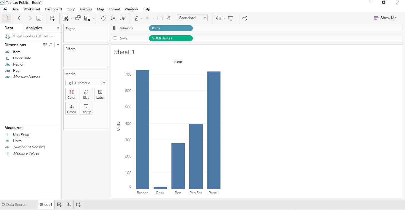
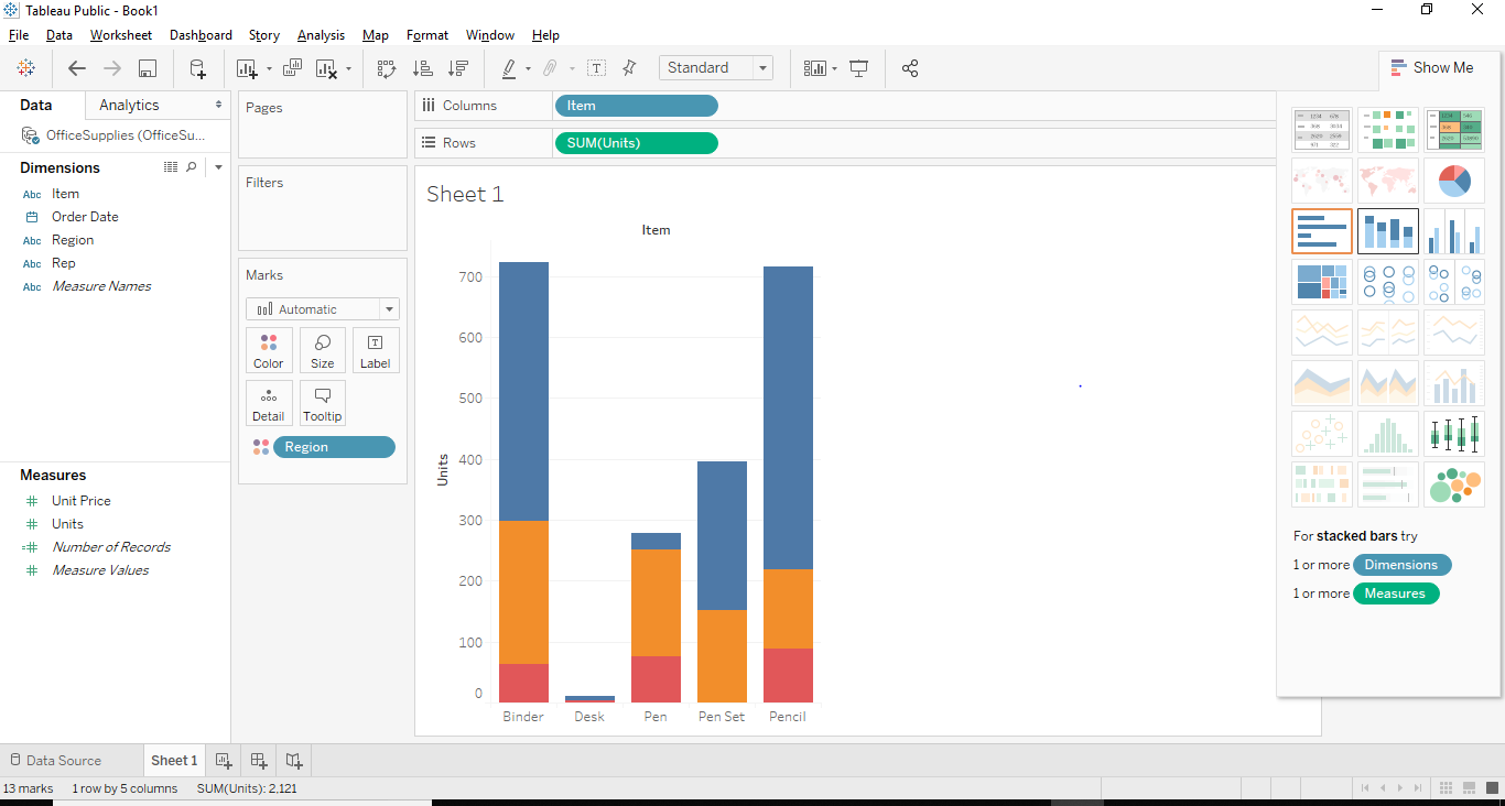
Now, if we want to create a proper bar chart we can create that by dragging and dropping one of the dimension regions into the column region. In our case, we can use the dimension “Item” for that purpose. Once we drag and drop the Item dimension into the column section. We will see a bar graph where each bar will represent a particular name/brand of the item and the height of the bar will represent sum (aggregate) of Units for that class of the car. In this below Screenshot, we can see the same has been illustrated.
Now to create a properly stacked bar graph, we would need a segment. In our case, we can use the Region as a proper segment. So what region will do is it will divide the names of items based on the region from where it belongs. In our dataset, we have three regions namely East, West and central. To make these fairly attractive and recognizable, we are going to drag “Region” from dimension region to marks card. Once we drag the “Region” to marks card, we will get to see the stacked Tableau chart.
Now let’s try to create a Stacked Bar Chart using a second approach. This approach will be a little different at the end but will give the same result.
Approach 2
All steps from step 1 to step 6 will remain the same in the second approach as well. The step will change from step 7.
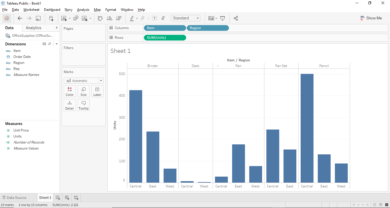
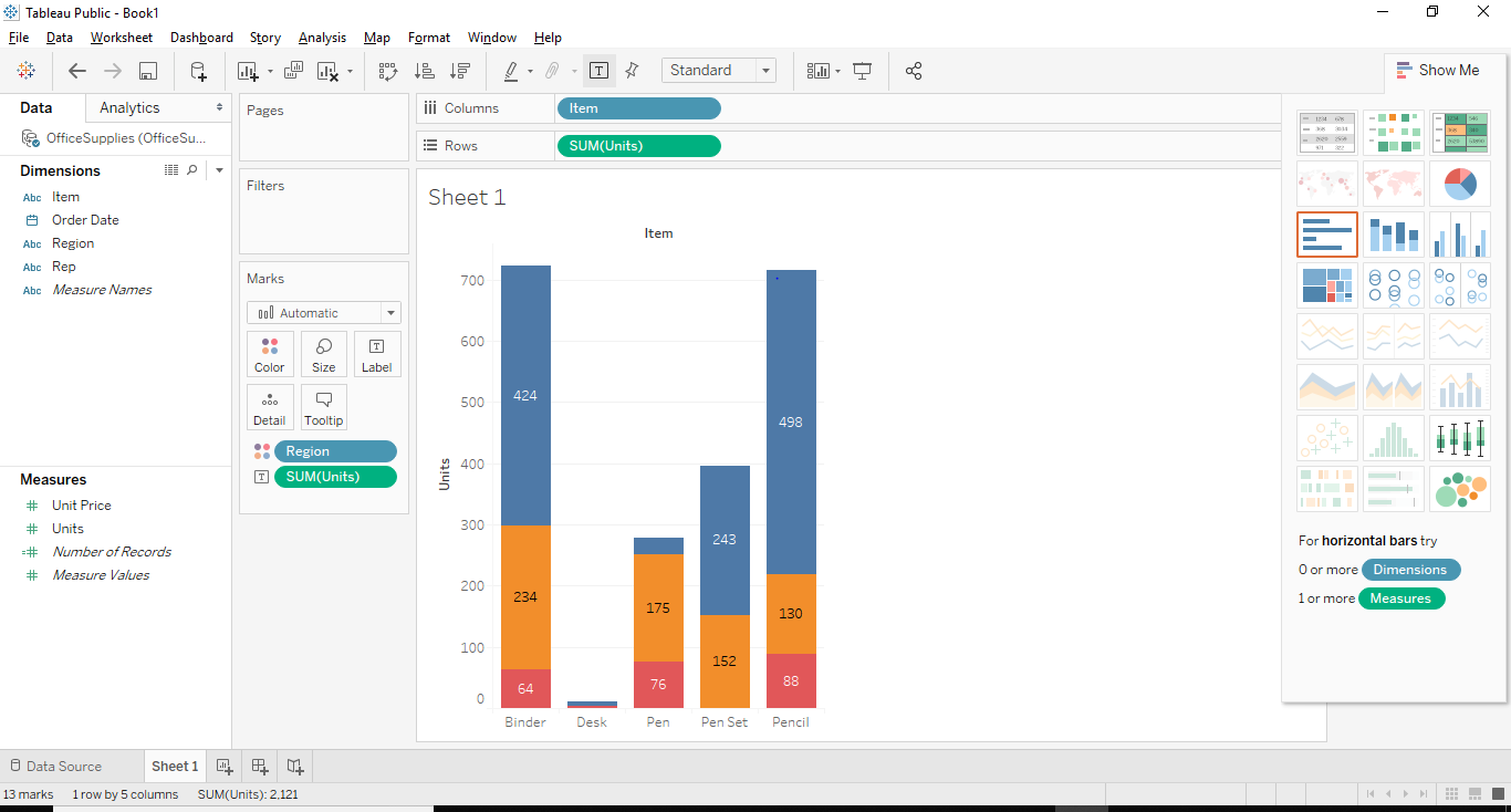
In this case, let us first remove the segment “Region” from a color shelf and place the “Region” in the column section right beside “Item” from dimension region. So once we drag and drop “region” from the color shelf to the Column section. We will see the below bar graph in Tableau.
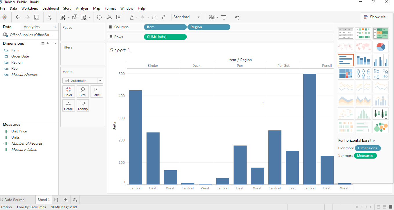
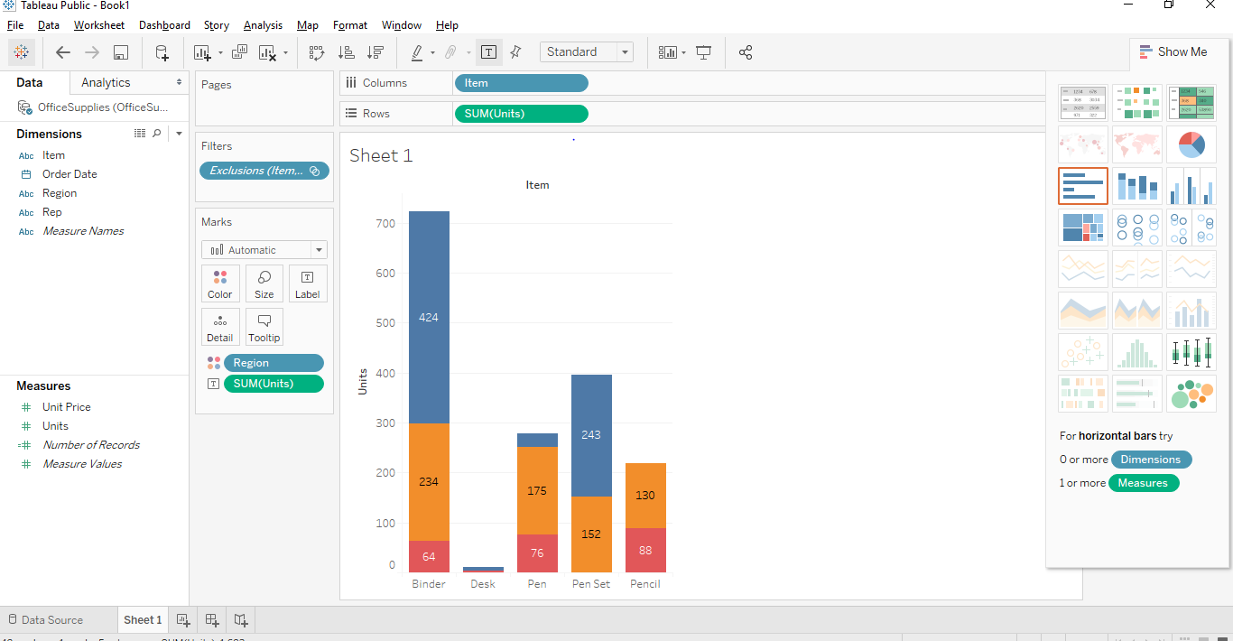
Now after getting the above graph, we have to convert the bar graph to Stacked Bar Graph and for that, we need to see the previous screenshot above where there is a button called show me button in the top right corner. The show-me button provides various graphs and charts and a user can choose any of the applicable graphs. The applicable graphs will be highlighted. The below screenshot shows the “Show Me” button.
As you can see above the Stacked Bar Graph is highlighted and we just have to click on the stacked bar graph and a stacked bar graph similar to approach 1 will be created as shown below.
Interesting Points
We can add labels to the stacked bar graph by clicking on the “Show Mark Labels” button situated in the toolbar. Once we click on that we will be able to add mark labels on our graph as shown below.
Another way of bringing the levels would be to drag and drop one of the data labels from measures or dimensions pane to level shelf present in marks card. In our case, we wanted to set the number of units as labels. So, we drag and dropped the “Unit” label from measures pane into the labels shelf.
The interesting feature in Tableau is that if you select any specific stack, it shows you the details of that particular stack.
We can also remove any particular stack from the stacked bar graph. For that just select the stack you want to remove and press exclude on the dialog box that appears and that stack gets removed from the graph. In our case, we removed the top right corner stack from our graph.
Recommended Articles
This is a guide to Stacked Bar Chart in Tableau. Here we have discussed the basic concept and different approach to create a stacked bar chart in tableau with Screenshots. You can also go through our other suggested articles to learn more –
A Pareto chart is a type of chart that contains both bars and a line graph, where individual values are represented in descending order by bars, and the ascending cumulative total is represented by the line. It is named for Vilfredo Pareto, an Italian engineer, sociologist, economist, political scientist, and philosopher, who formulated what has become know as the Pareto principal. Pareto made the observation that 80% of land was typically owned by 20% of the population. Pareto extended his principle by observing that 20% of the peapods in his garden contained 80% of the peas. Eventually, the principal was further extrapolated by others to propose that for many events, roughly 80% of the effects come from 20% of the causes. In business, for example, 80% of profits not infrequently derive from 20% of the available products.
In Tableau, you can apply a table calculation to sales data to create a chart that shows the percentage of total sales that come from the top products, and thus identify the key segments of your customer base that are most important for your business's success.
The procedure uses the Sample - Superstore data source provided with Tableau Desktop.
Preparing for the analysis
Before starting your analysis, decide what questions you want answered. These questions determine the category (dimension) and number (measure) on which to base the analysis. In the example to follow, the question is which products (captured by the Sub-Category dimension) account for the most total sales.
At a high level, the process requires you to do the following:
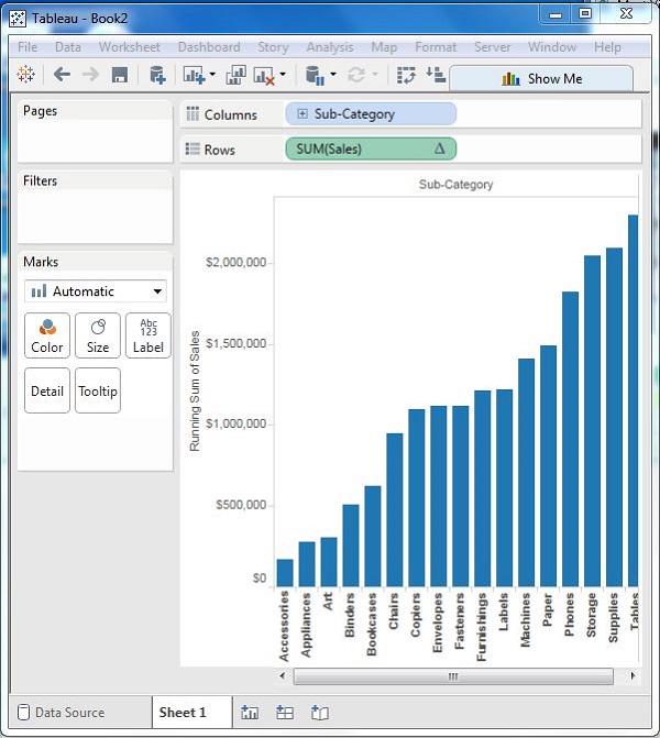
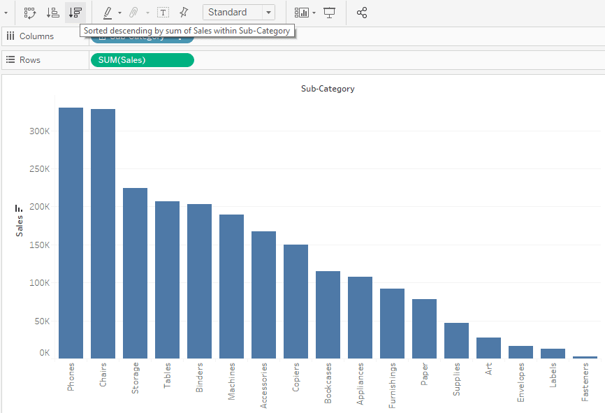
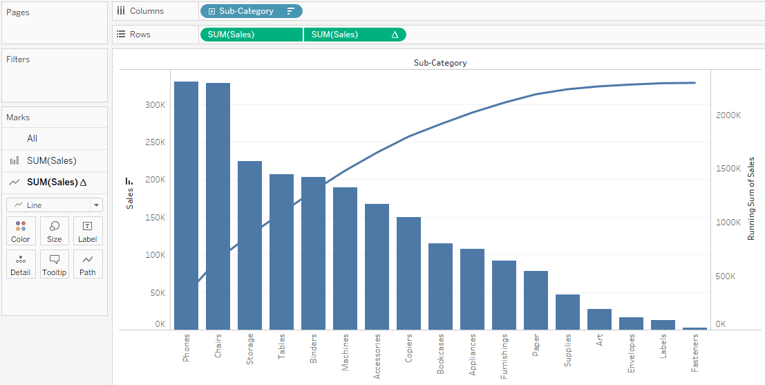
Create a bar chart that shows Sales by Sub-Category, in descending order.
Add a line chart that also shows Sales by Sub-Category.
Add a table calculation to the line chart to show sales by Sub-Category as a Running Total, and as a Percent of Total.
The scenario uses the Sample - Superstore data source provided with Tableau Desktop
Create a bar chart that shows Sales by Sub-Category in descending order
Connect to the Sample - Superstore data source.
From the Data pane, drag Sub-Category to Columns, and then drag Sales to Rows.
Click Sub-Category on Columns and choose Sort.
In the Sort dialog box, do the following:
Under Sort order, choose Descending.
Under Sort by, choose Field.
Leave all other values unchanged, including Sales as the selected field and Sum as the selected aggregation.
Click OK to exit the Sort dialog box.
Products are now sorted from highest sales to lowest.
Add a line chart that also shows Sales by Sub-Category
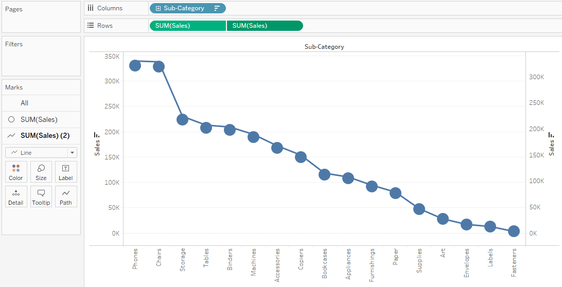
From the Data pane, drag Sales to the far right of the view, until a dotted line appears.
Note: In Tableau 2020.2 and later, the Data pane no longer shows Dimensions and Measures as labels. Fields are listed by table or folder.
Drop Sales, to create a dual-axis view. It's a bit hard to see that there are two instances of the Sales bars at this point, because they are configured identically.
Select SUM(Sales) (2) on the Marks card, and change the mark type to Line.
''This is what the view should look like at this point:
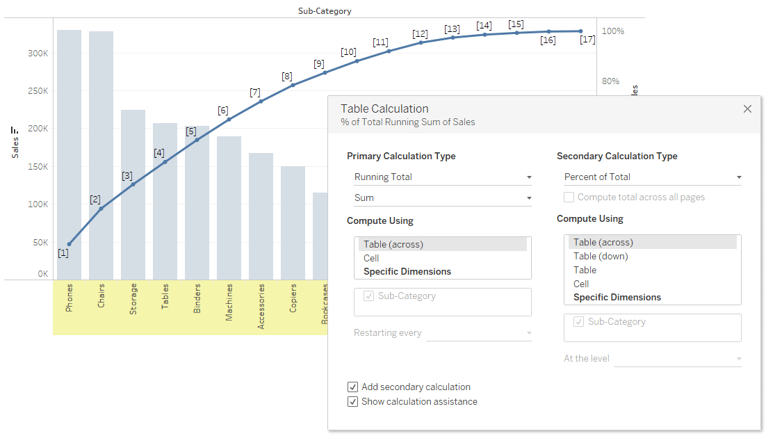
Add a table calculation to the line chart to show sales by Sub-Category as a running total, and as a percent of total
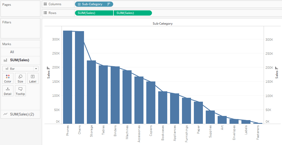
Click the second copy of SUM(Sales) on Rows and choose Add Table Calculation.
Add a primary table calculation to SUM(Sales) to present sales as a running total.
Choose Running Total as the Calculation Type.
Do not close the Table Calculation dialog box.
Add a secondary table calculation to present the data as a percent of total.
Click Add Secondary Calculation and choose Percent of Total as the Secondary Calculation Type.
This is what the Table Calculation dialog box should look like at this point:
Click the X in the upper-right corner of the Table Calculations dialog box to close it.
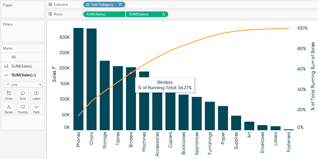
Click Color in the Marks card to change the color of the line.
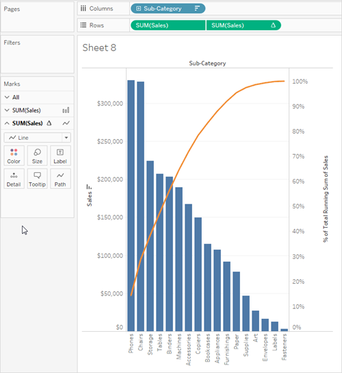
The result is now a Pareto chart:
Additional information
For additional tips on how you would compare the percentage of sales with the percentage of products, or draw reference lines that help mak
============================
Pareto charts – named for the Pareto principle inspired by Italian economist, Vilfredo Pareto – help visualize the dimension members causing the biggest impact. What better way to move the needle than to focus your efforts on the 20% of your business causing 80% of the results?
This tutorial will show you how to make a traditional Pareto chart in Tableau and three ways to make them even more impactful. We’ll cover how to: (1) visualize the 80/20 rule by converting axes into percent of total calculations, (2) isolate the best-performing segment for further analysis, and (3) export the best-performing segment for use in real-world applications.
Traditional Pareto charts use a combination of sorted bars and a dual axis displaying the percent of running total for the measure being analyzed. For the first example, we’ll evaluate the Sales measure by the Sub-Category dimension in the Sample – Superstore dataset that comes with every download of Tableau Desktop. To start, place the Sales measure on the Rows Shelf, the Sub-Category dimension on the Columns Shelf, and click the Sort Descending button in the top tool ribbon.
Next, place the measure being evaluated (sum of Sales, in this case) onto the Rows Shelf a second time, change the mark type to Line by changing the mark type dropdown on the third Marks Shelf, and convert the chart into a dual-axis combination chart by clicking the second SUM(Sales) pill on the Rows Shelf and selecting “Dual Axis”.
Tableau has automatically changed the mark type of the marks on the first axis to Circle. To create a traditional Pareto chart with a combination of bars and lines, we need to click the second Marks Shelf (the one controlling the marks on the first axis) and change the mark type dropdown back to Bar.
Next, add a quick table calculation to the second axis by right-clicking on the second pill on the Rows Shelf, hover over “Quick Table Calculation”, and choose “Running Total”.
Running Total and Moving Average table calculations are unique in Tableau in that you can add a secondary table calculation – or a table calculation of a table calculation, if you will. To convert the right axis, which is currently showing us a running sum of sales in dollars, to a percent of running total, right-click on the second pill on the Rows Shelf (the one with the table calculation being applied) and choose “Edit Table Calculation”.
This will open a dialog where you can choose to add a secondary table calculation by checking the box next to “Add secondary calculation”. Here are the settings after following these steps and choosing Running Total as the secondary table calculation.
After clicking the “X” button in the top-right corner of the dialog, you are left with a traditional Pareto chart showing you sales on the left axis with bars sorted in descending order and running percent of total sales on the right axis with a mark type of Line. Here is how my final example looks after some formatting updates including colors.
By hovering over Binders, this visualization is telling me that the top five sub-categories in the Sample – Superstore business are providing 56.27% of all gross sales.
How to Visualize the 80/20 Rule in Tableau
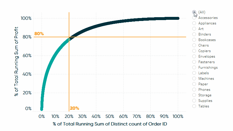
In the first example, we did not reach the 80% of sales mark until somewhere between the Copiers and Bookcases sub-categories, which were the eighth and ninth out of seventeen sub-categories, respectively. In other words, this turned out to be more like the 80/50 rule instead of the 80/20 rule, where 80% of our sales came from 50% of our dimension members.
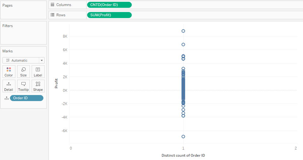
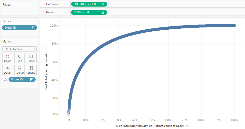
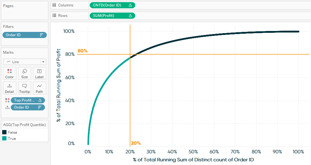
For a more powerful and precise Pareto chart, we will build a version that tracks the percent of running total of results on the y-axis by the percent of running total of causes on the x-axis. For this example, I will analyze the Profit measure by COUNTD([Order ID]) to find out what percent of my orders are generating 80% of the profit.
To begin, place the measure you want to analyze the results for (sum of Profit, in this case) on the Rows Shelf and the measure that is generating the results (count distinct of Order ID, in this case) on the Columns Shelf. The easiest way to convert the dimension of Order ID to the measure of COUNTD([Order ID]) is to right-click while you drag the Order ID dimension to the Columns Shelf, then choose “CNTD” on the dialog that appears.
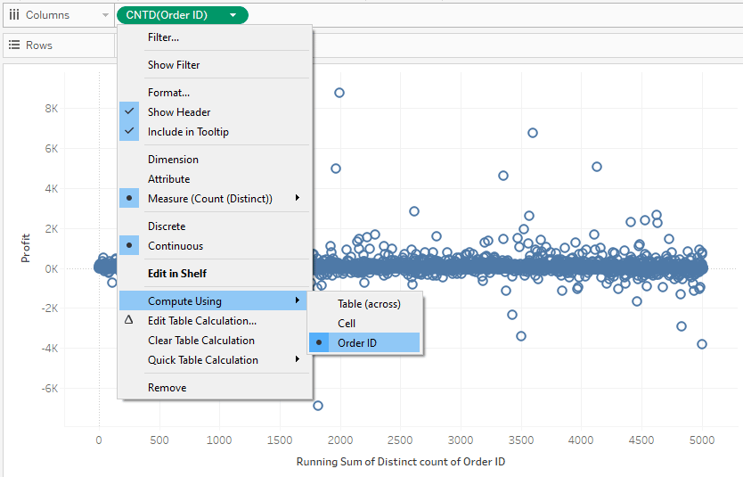
Since we need all causes accounted for in the analysis, we will also need to add every dimension member we want to analyze to the view somehow. Right now, CNTD([Order ID]) is consolidating every Order ID into a single value of 5,009 on the x-axis. To ensure each individual Order ID is on the view and can be computed, drag the Order ID dimension to the Detail Marks Card. Here is the foundation of my “80/20 Pareto” chart.
As with the traditional Pareto chart, the next step is to add a Running Total table calculation, but this time we will add the table calculation to both measures being used on the view. For the first, right-click on the measure on the Columns Shelf, hover over “Quick Table Calculation”, and choose “Running Total”. At first, you will not see anything other than the axis title change. That is because we must change the addressing of the table calculation from the default, Table (across), to Order ID. To change the addressing, right-click on the pill containing the table calculation, hover over “Compute Using”, and choose the dimension being used (Order ID, in this case).
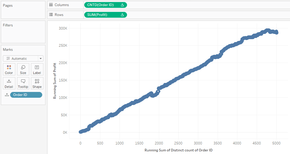
Follow these same steps for the measure on the Rows Shelf – add a quick table calculation of Running Total and ensure the addressing is changed to Order ID. After doing so, you should see the following coming together:
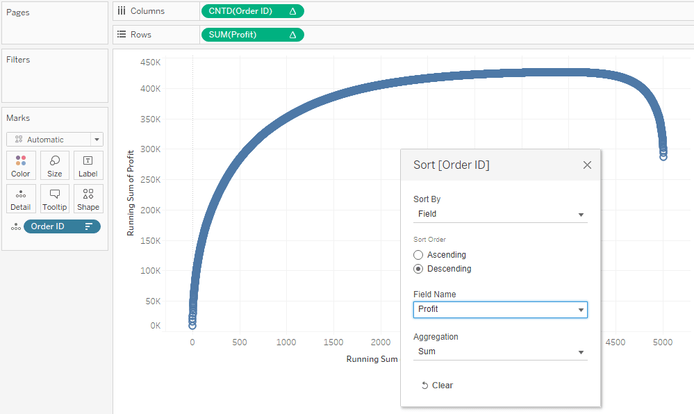
This is headed in the right direction, but we don’t see the nice smooth curve we would expect to see with a Pareto chart. This is because while every Order ID is accounted for in the view and we are seeing their collective running total from left to right, they are not sorted from the best-performing orders to the worst-performing orders. To re-sort the dimension members, right-click on the dimension on the Detail Marks Card and choose “Sort”. After updating the settings in the dialog to sort the IDs by the measure we are evaluating in descending order, we see the smooth curve come into shape.
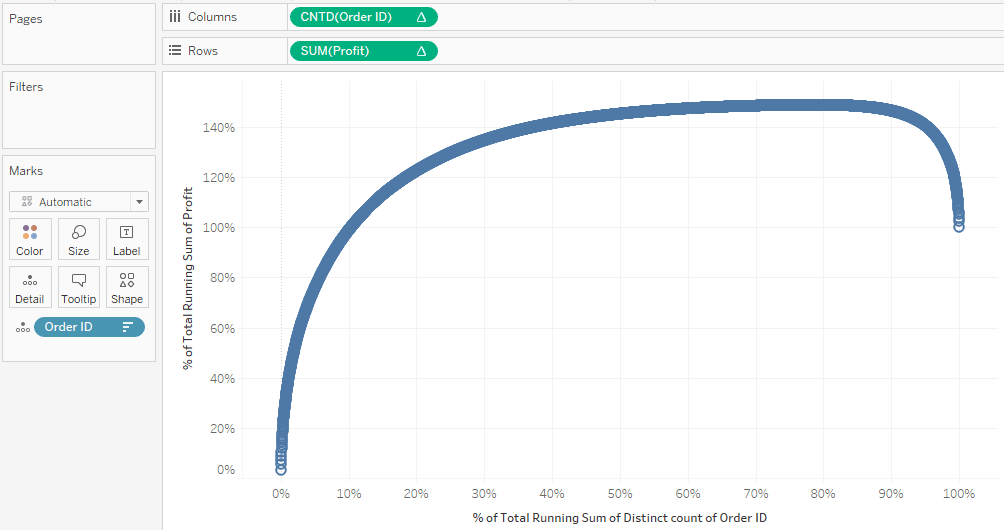
At this point, both axes are showing us integers, but we want them to display running percent of totals. Again, because we have used Running Total as our primary table calculation, we can add a secondary table calculation of “Percent of Total” to compute a percent of running total. As with our first example, this can be accomplished by right-clicking a measure with a table calculation being applied to it, choosing “Edit Table Calculation”, checking the “Add secondary calculation” box at the bottom of the dialog, and changing the secondary calculation to “Percent of Total”.
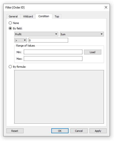
We now see percentages of running totals for our results on the y-axis and percentages of running totals for our causes on the x-axis. Note on the x-axis, we end up at 100% from left to right, but our scale goes from 0 to 140% on our y-axis. Since some orders have negative profits, our running total first pushes above 100% before the negative results bring the curve back to end up at 100%. To focus on profitable orders only, I will drag the Order ID field to the Filters Shelf, click the Condition tab, and set the following rule:
After adding this filter, we see both percent of running total scales going from zero to 100%.
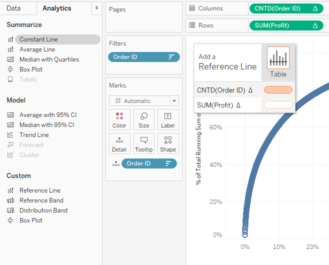
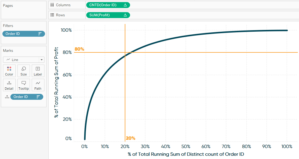
Lastly, to show the audience the intersection of 20% of causes and 80% of results, I will add a constant reference line to each axis. The easiest way to do this is to click the Analytics tab on the left side of the Authoring interface and drag Constant Line onto the view.
After dropping the Constant Line onto one of the two axis options, a dialog will appear where you can enter a value. For the x-axis, enter a value of .2, which is the same thing as 20%. Repeat this step for the y-axis and enter .8, which is the same thing as 80%. Here is my final 80-20 Pareto after adding these reference lines and making format updates.
This visualization is showing us that the orders in the Sample – Superstore dataset are indeed following very close to the 80/20 rule, where just over 20% of orders provided 80% of total profit!
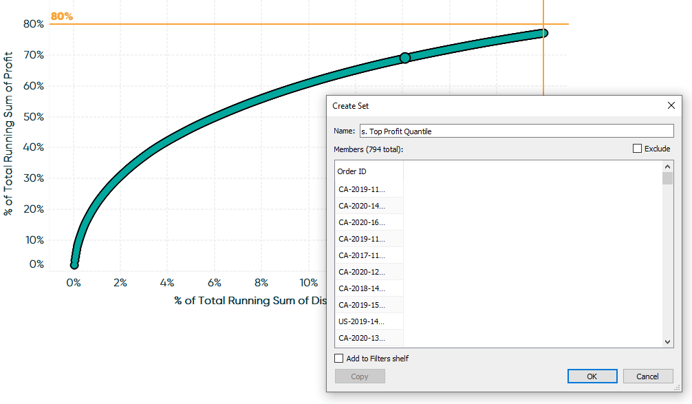
How to Isolate the Top Performing Quantile
If I can impact roughly 80% of my business’ performance by focusing on just 20% of the causes, the next thing I want to do is isolate that top-performing segment for further analysis. What are they buying? Where do they live? How did they hear about us so we can create more customers like them?
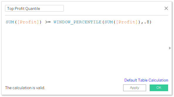
To classify dimension members as being in the top quantile (20%) for your key performance indicator, create a calculated field and use the following formula (replace “KPI” with your own field):
SUM([KPI]) >= WINDOW_PERCENTILE(SUM([KPI]),.8)
Next, place this field onto the Color Marks Card. This calculation contains a table calculation of WINOW_PERCENTILE so, by default, it will compute from left to right and classify every dimension member as “True”. To get the desired effect, right-click on the calculated field just added to the Color Marks Card, hover over “Compute Using”, and choose the dimension you are evaluating (Order ID, in my case).
To precisely isolate our top 20% of orders, we can filter the view to only Order IDs classified as True by right-clicking True in the color legend, then choosing “Keep Only” on the dialog that appears. Then, click CTRL + A to select all the marks on the view, hover over any of the marks, and click the Venn diagram icon to create a set.
We have just captured our top 20% of orders as a set and can use this set in other views to analyze customer behavior! See our video at Playfair Data TV for several ideas on using Tableau sets to analyze segments.
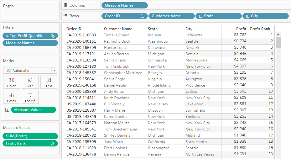
How to Export the Top Performing Segment for Further Action
One of the many ways to utilize the set created in the previous section is to create a data table with information about your top performing segment, add the newly created top quantile set to the Filters Shelf to keep only the dimension members in the set, and then export the table as an Excel file that can be used in other applications.
Here is an example where I have created a crosstab containing Order ID, Customer Name, and their location. I have also added their sum of profit performance, a measure that calculates their rank with the formula RANK(SUM([Profit])), and sorted the table in descending order. Don’t forget to add the Top Quantile set to the Filters Shelf!
With this table created, one of the ways you can export it straight to Excel is to click Worksheet in the top menu, hover over Export, and choose “Crosstab to Excel”. Of course, this table can be customized with data from your real-world use cases including phone numbers, addresses, or demographics. With this list in hand, we can create tailored marketing campaigns, conduct focus groups, or implement sales initiatives – all straight to our best customers!