Tableau - Bubble Chart
Bubble charts display data as a cluster of circles. Each of the values in the dimension field represents a circle whereas the values of measure represent the size of those circles. As the values are not going to be presented in any row or column, you can drag the required fields to different shelves under the marks card.
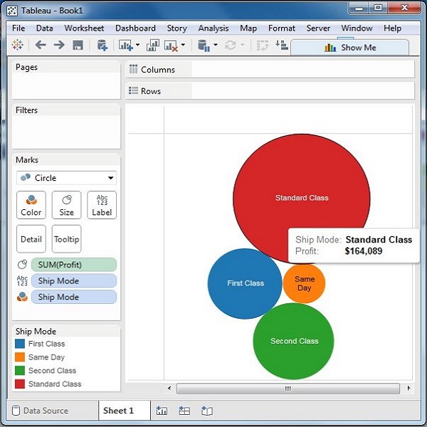
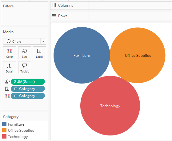
Simple Bubble Chart
Using the Sample-superstore, let's plan to find the size of profits for different ship mode. To achieve this objective, following are the steps.
Step 1 − Drag and drop the measure profit into the Size shelf under Marks card.
Step 2 − Drag and drop the dimension ship mode into the Labels shelf under Marks card.
Step 3 − Pull the dimension ship mode to the Colors shelf under Marks card.
The following chart appears.
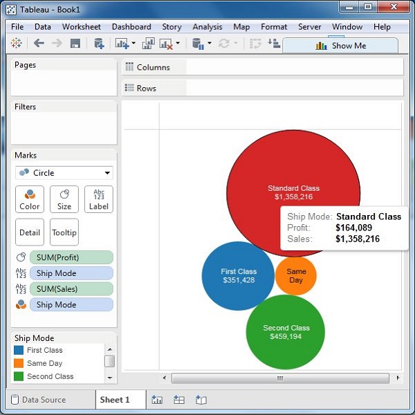
Bubble Chart with Measure Values
You can also show the values of the measure field which decides the size of the circles. To do this, drag the sales measure into the Labels shelf. The following chart appears.
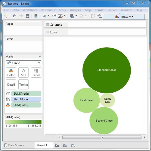
Bubble Chart with Measure Colors
Instead of coloring each circle with a different color, you can use a single color with different shades. For this, drag the measure sales into the color shelf. The higher values represent darker shades while the smaller values represent lighter shades.
====================================
Use packed bubble charts to display data in a cluster of circles. Dimensions define the individual bubbles, and measures define the size and color of the individual circles.
The basic building blocks for a packed bubble chart are as follows:
| Mark type: | Circle |
| Detail: | Dimension |
| Size: | Measure |
Color: | Dimension or Measure |
| Label (optional): | Dimension or Measure |
To create a basic packed bubble chart that shows sales and profit information for different product categories, follow these steps:
Connect to the Sample - Superstore data source.
Drag the Category dimension to Columns.
A horizontal axis displays product categories.
Drag the Sales measure to Rows.
The measure is aggregated as a sum and a vertical axis appears.
Tableau displays a bar chart—the default chart type when there is a dimension on the Columns shelf and a measure on the Rows shelf.
Click Show Me on the toolbar, then select the packed bubbles chart type.
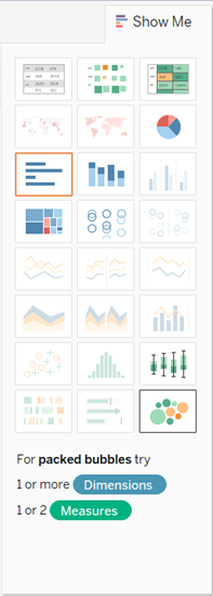
Tableau displays the following packed bubble chart:
Drag Region to Detail on the Marks card to include more bubbles in the view.
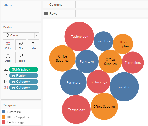
Next we'll add another layer of information to the view.
Drag Profit to Color on the Marks card:
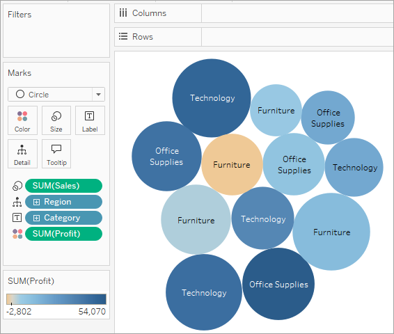
Drag Region to Label on the Marks card to clarify what each bubble represents.
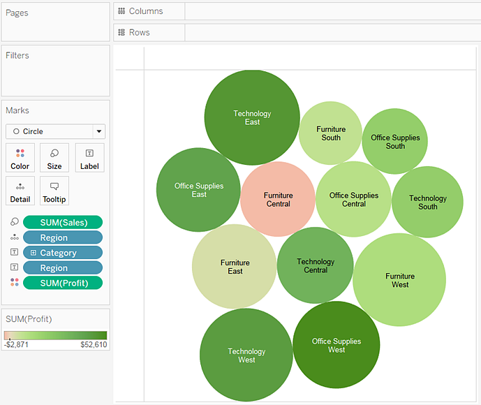
The size of the bubbles shows the sales for different combinations of region and category. The color of the bubbles shows the profit (the darker the green, the greater the profit).
For information about formatting mark labels, see Show, Hide, and Format Mark Labels.
To further develop this view, you might edit the colors for Profit to show negative profit in a different color, or create a calculated field to shows profit divided by sales (that is, profit margin) and then drop that on Color instead of absolute profit. For more information, see Color Palettes and Effects.
Check your work! Watch steps 1-7 below:
Note: In Tableau 2020.2 and later, the Data pane no longer shows Dimensions and Measures as labels. Fields are listed by table or folder.


No comments:
Post a Comment