Build a Bullet Graph
A bullet graph is a variation of a bar graph developed to replace dashboard gauges and meters. A bullet graph is useful for comparing the performance of a primary measure to one or more other measures. Below is a single bullet graph showing how actual sales compared to estimated sales.
Follow the steps below to learn how to create a bullet graph.
Open Tableau Desktop and connect to the World Indicators data source.
Navigate to a new worksheet.
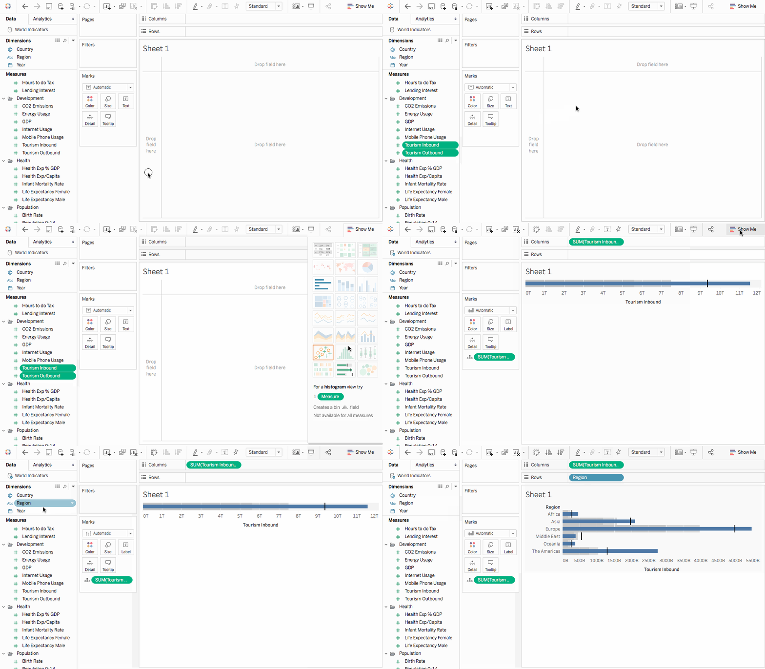
Hold down Shift on your keyboard and then, on the Data pane, under Development select Tourism Inbound and Tourism Outbound.
In the upper-right corner of the application, click Show Me.
In Show Me, select the Bullet Graph image.
Click Show Me again to close it.
From the Data pane, drag Region to the Rows shelf.
The graph updates to look like the following:

Check your work! Watch steps 3 - 7 below:

Note: In Tableau 2020.2 and later, the Data pane no longer shows Dimensions and Measures as labels. Fields are listed by table or folder.
Swap reference line fields
Sometimes you might want to swap the reference lines fields. For example, the actual sales is shown as a reference distribution instead of a bar.
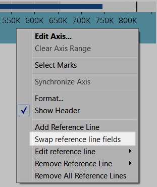
To swap the two measures, right-click (control-click on the Mac) the axis and select Swap Reference Line Fields.

Edit the distribution
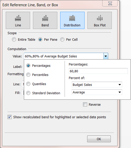
Right-click (control-click on the Mac) the axis in the view and select Edit Reference Line, and then select one of the reference lines to modify.


No comments:
Post a Comment